Charts and graphs are a great way to bring data to life and they can help the reader understand what the data is telling us. However, choosing the wrong data visualization tool for the task at hand can be confusing or even misleading for the audience. Before you have to prepare your next PowerPoint presentation for a work meeting or class project, let’s look at a couple of pitfalls to avoid.
Choosing the wrong tool for your data
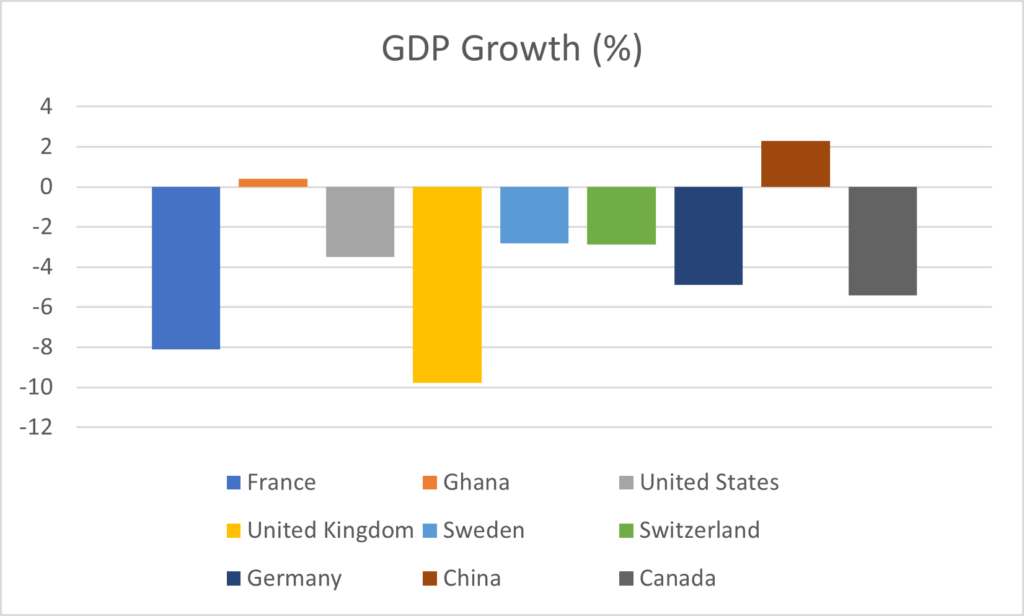
For example, suppose you want to visualize GDP growth data from the year 2020 for a few countries. This data is available from the World Bank. Now take a look at the two examples in Figure 1 below. Both are examples of data visualizations that are not useful for the reader.

Line graphs (like the example on the left) can be a great tool if you are trying to visualize data over time. In our example however, we are looking at GDP growth in different countries during the same year, so connecting all these data points with a line does not make sense at all.
The pie chart (on the right) is also not a good choice here. First of all, if you look at the line graph on the left, you clearly see that GDP growth was negative for most countries in 2020 (thanks Covid!). So how would you even represent negative values on a pie chart? Secondly, GDP growth for a sample of countries will not add up to 100%, so representing it with a pie chart is not the way to go.
Instead, for this data visualization I’d recommend a column chart similar to this one:

Colors, colors, colors…
Representing data in different colors can go a long way in making it easier to interpret. Unfortunate color choices can however have the opposite effect. Take a look at the example below to see what I mean.

So what went wrong here? In the chart on the left, a red bar represents the vote for the Democratic party, while the vote for the Republicans is colored in blue. Now that is extremely confusing, since we usually associate the Democratic party with the color blue, while red stands for the Republicans.
In the graph on the right, a green bar represents the Democratic vote. This leads to two problems: the first is the same as in the graph on the left; we associate Democrats with the color blue, not green. The second problem is that many people are red-green colorblind and may not even be able to clearly see the difference. Be sure to think about color when creating your data visualizations.
Truncated axes, oh my…
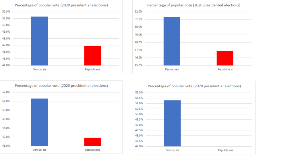
Now that we have cleaned up the color-coding from the previous example, let’s take another look.

While this may look like election fraud to you on first glance since votes seem to be disappearing, look again — I did not change anything about the data, only where I start my vertical axis. In the first graph in the upper left-hand corner, the vertical axis starts at 44% of the vote. The Republicans got 46.9% of the popular vote, the Democrats 53.1%. In the second graph on the upper right, I represented the same data, but this time I started my vertical axis at 45% instead of 44%. This makes the difference between the two bars appear larger; it’s almost like the second bar shrunk! You can see this even more clearly when you look at the two graphs on the bottom, here I even made the Republican bar disappear altogether by starting the vertical axis at 47%.
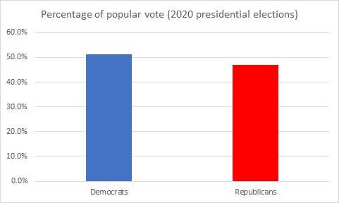
The lesson we learn from this example is that bar charts should always start at 0. Axes should not be truncated. That way, we get an accurate picture of the difference between two categories.

In Figure 5, the election results look less like a landslide and represent the actual difference in the vote percentage. So, the important take-away here is, bar charts should always start at zero or they will misrepresent actual differences between categories. This article by Nathan Yau goes into more detail and provides additional examples. I would like to point out that many people probably don’t intend to be misleading in how they visualize their data. However, the software’s default setting may be to truncate the axes. (For example, the graphs in Figure 3 were created with the default settings in Microsoft Excel).
Conclusion
In this post I have shown you a couple of things to keep in mind when visually representing data. We want graphs and charts to be helpful, not confusing or misleading. If you want to learn more about data visualization, become a Buff and take courses such as statistics, quantitative analysis or information visualization!
Anne-Christine Barthel
Assistant Professor of Economics and Decision Management


